


Cute and Cool Learning Bite for Remote Workers
Another endless Zoom meeting. Confusing emails. How do remote workers learn to communicate effectively and respectfully with their team?
What we needed: Visually compelling, high-impact content for small courses on the subject of digital leadership.
Here’s your first taste.
The Problem
In a remote working world, communicating effectively can be a challenge. Team members are often stymied by how to give feedback to colleagues, exchange information, and get work done without ruffling too many feathers. This can lead to a company culture that lacks trust and respect - and workers won’t stick around.
The Solution:
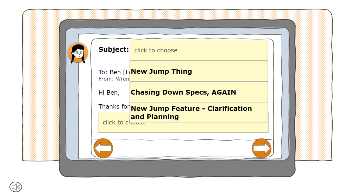
I proposed a microlearning experience that simulates tricky communication in the remote workplace - Zoom calls where video cameras are turned off … Slack boards that get too distracting … and unclear emails need following up. My sample unit simulates a team of video game developers. Wren, the lead programmer, receives an unclear email. The learner is tasked with helping her craft a response that refocuses her colleague with respect and curiosity.
Target audience
Remote Workers
Learning Objective
Choose the best phrases in an email to respond to an unclear email request.
Tools used
Articulate Storyline 360
PowerPoint
The Process
Brainstorming
Because I am not an expert on effective digital communication in a remote work environment, I asked my AI friends to help me to develop the content. After reviewing lots of options, I decided to create a fill-in-the-blank learner interaction, where an email template contains language options in dropdown menus. This type of interaction is practical and relevant to a real-world communication scenario.
Designing the Interaction
Some of my main considerations when designing the interaction:
Keep the learner’s experience front and center at every stage of design and development
Make sure that the learner is active from the beginning by eliminating unnecessary explanations
Keep the cognitive load manageable by using intuitive icons and navigation tools and avoiding voiceover when text is on-screen
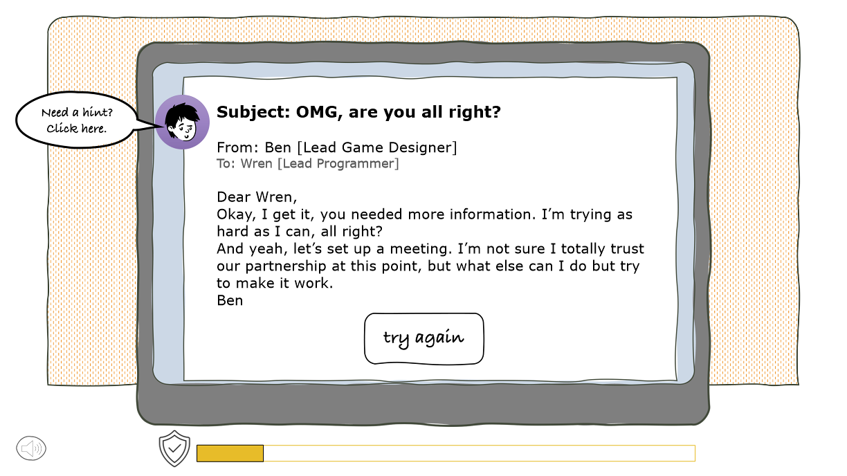
Provide feedback in the form of a “Trust Meter” and non-verbal audio cues - Wren takes audible deep breaths and grunts appropriately.
Graphics
Once I chose a font family and color template, I then used PowerPoint’s store of cartoon figures and shapes to create customized characters, buttons, callout text, Wren’s office and her computer screen. I wanted the overall design to be attractive but simple. I love how it turned out!


Building in Articulate Storyline 360
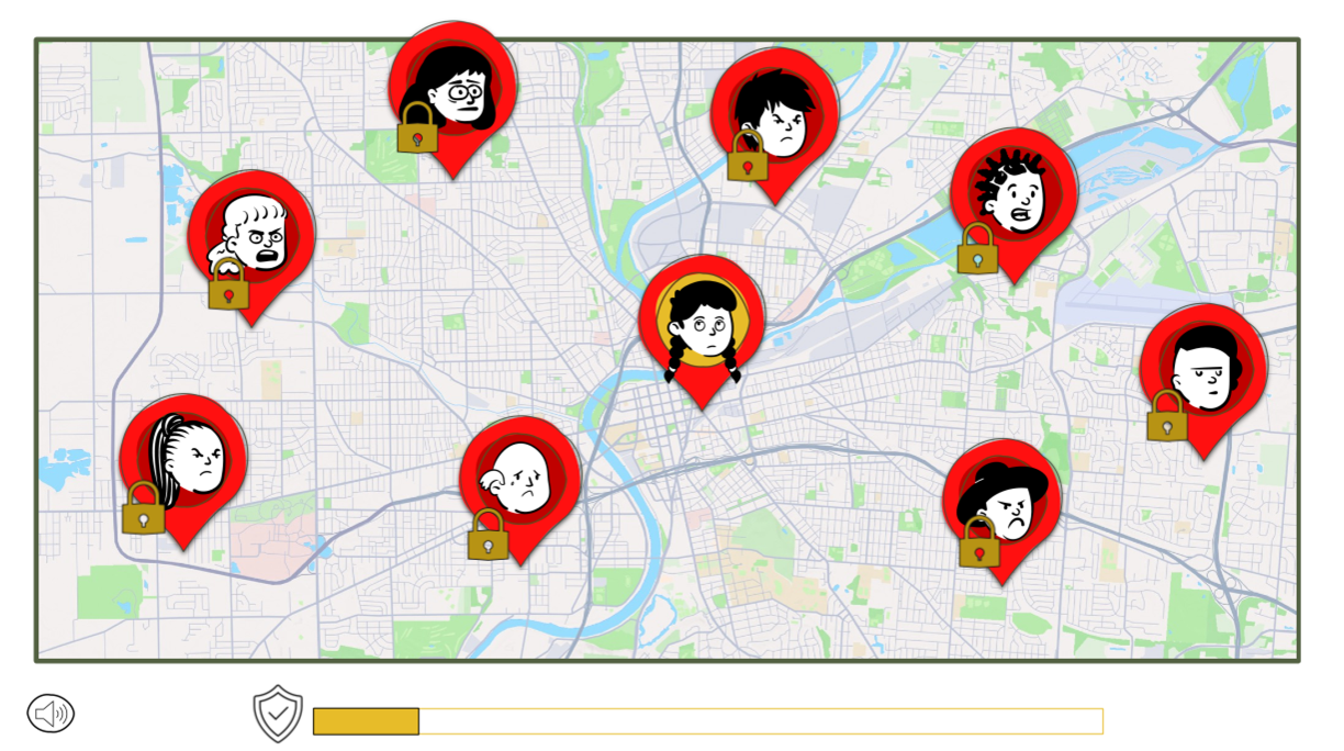
Things started coming together when I began importing graphics into Storyline. I love how the map, with the sad, frustrated characters on pins that pop up on the first screen, represent a remote team. In my concept, each map pin represents a different microlearning module. Only one is interactive - Wren’s icon, in the center of the screen - and when the mouse clicks on her, we begin the learner interaction.
When Wren opens the email from Ben, we understand that replying to it will be tricky - it’s an unclear request for a new feature in the video game. She has to reply
It took me a while to figure out how to design the reply email. I’m still not one hundred percent satisfied by the look of the reply email - it had to be split up over several screens, which meant that the learner was unable to read their entire response on one screen. I decided this sacrifice was necessary for the functionality of the interaction.

Each of the dropdown responses is worth points - depending on the appropriateness of the choice. I created the necessary triggers and layers for smooth functionality - again, keeping in mind a desire to lower the cognitive load by making the navigation intuitive. There were three possible consequence screens, depending on the learner’s score (which was reflected in the Trust Meter); the learner was encouraged to try again if the score was too low, but if you score high enough, you go back to the Main Screen.
Results & Takeaways
Once I was mostly happy with the project, I shared it out with colleagues for feedback. They made a few suggestions that, once included, immediately improved the project:
The background music is cute, but it can be distracting / annoying. (I created a “Music Off” button.)
The voice overs were … unfortunate. (On my zero-dollar budget, I did not hire VO actors but instead opted for the Storyline text-to-voice option.)
Some of the feedback - specifically, the “correct” email - was not very clearly indicated, and my testers missed it altogether. (I changed the button text to highlight the hint).
Testers agreed that they would have liked to reread their own assembled email reply, including their text choices, before hitting “Send.” (I decided to pass on this additional programming snarl due to time constraints.)
One tester said she wasn’t sure how to begin the interaction. (I let this go, as I always want learners to be engaged with figuring out the next step - using their brains - instead of mindlessly following the “click here” signs.)
Overall, the project, as it is designed, could function as a 5-minute module in a short course about communication with remote team members. I love how it turned out, and I can’t wait to tackle more projects that challenge my design and development skills!